Redge.
Repositioning an HVAC pioneer with a new name, brand identity and strategy for growth
Manufacturing + EngineeringBrand strategyBrand identityCampaign
"I loved the challenge of combining decades of trust with a fresh, ambitious identity that energises everyone connected to the brand."
Creative Director
Reclaiming leadership through a new name, identity and strategy
For over 60 years, Lennox was a trusted name in HVAC across Europe, the Middle East and Africa. Known for pioneering rooftop systems, the brand earned loyalty through reliability, engineering excellence and long-standing customer relationships.
When global Lennox divested, the EMEA business faced a legal requirement to change its name. At the same time, new private equity ownership created a mandate for value creation and growth. The challenge: protect decades of brand equity while creating a new identity that could be legally secured, digitally visible and strategically positioned for the future.
Honouring legacy and unlocking the future
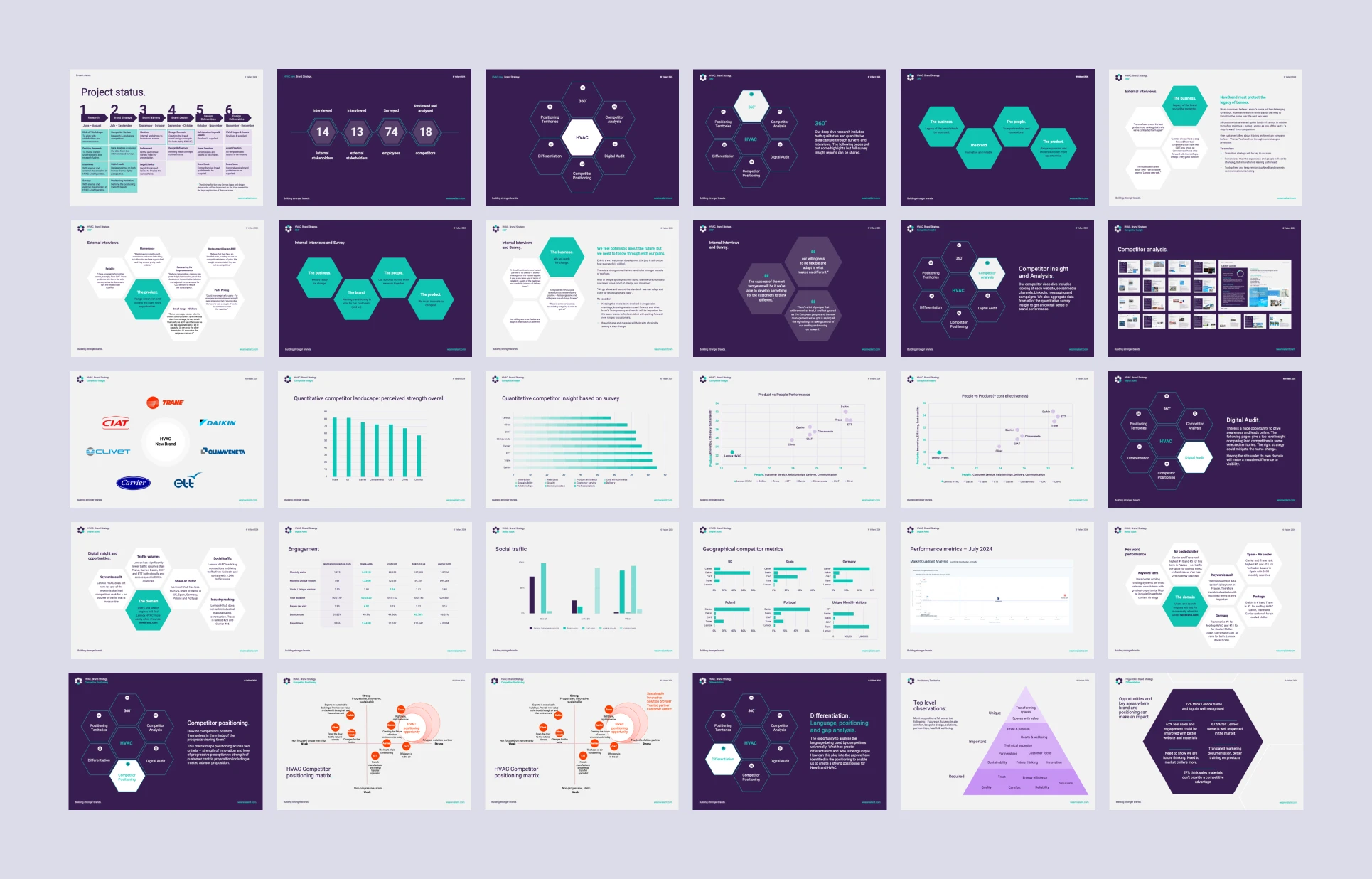
Research confirmed the scale of the opportunity. Customers praised Lennox’s reliability and innovation, while employees highlighted the strength of its relationships and family-like culture. At the same time, there was an appetite for change – to modernise, expand beyond rooftops and communicate with greater clarity and ambition.
The new brand had to:
- Protect hard-earned trust while reassuring customers that the people and service they valued would remain.
- Create a name and identity that could scale across rooftops, chillers, heat pumps, AHUs and data centres.
- Stand out in a crowded market dominated by Daikin, Carrier and Trane by claiming clear whitespace.
- Inspire employees, investors and customers with a stronger sense of purpose and progress.
Our approach – insight, strategy, naming and identity aligned
We applied Valiant’s Value Realisation Methodology, combining market insight with stakeholder alignment to shape a strategy that balanced continuity and change.
- Deep insight: interviews, surveys and competitor benchmarking revealed how Lennox was perceived, where competitors claimed ground and where opportunity existed.
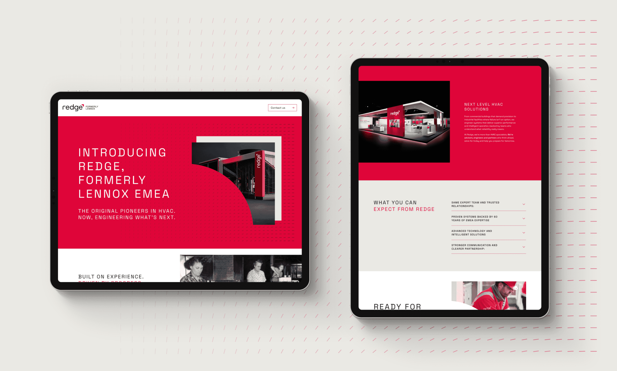
- Customer-led reassurance: a two-year transition strategy, using “Formerly Lennox,” safeguarded trust while the new brand built recognition.
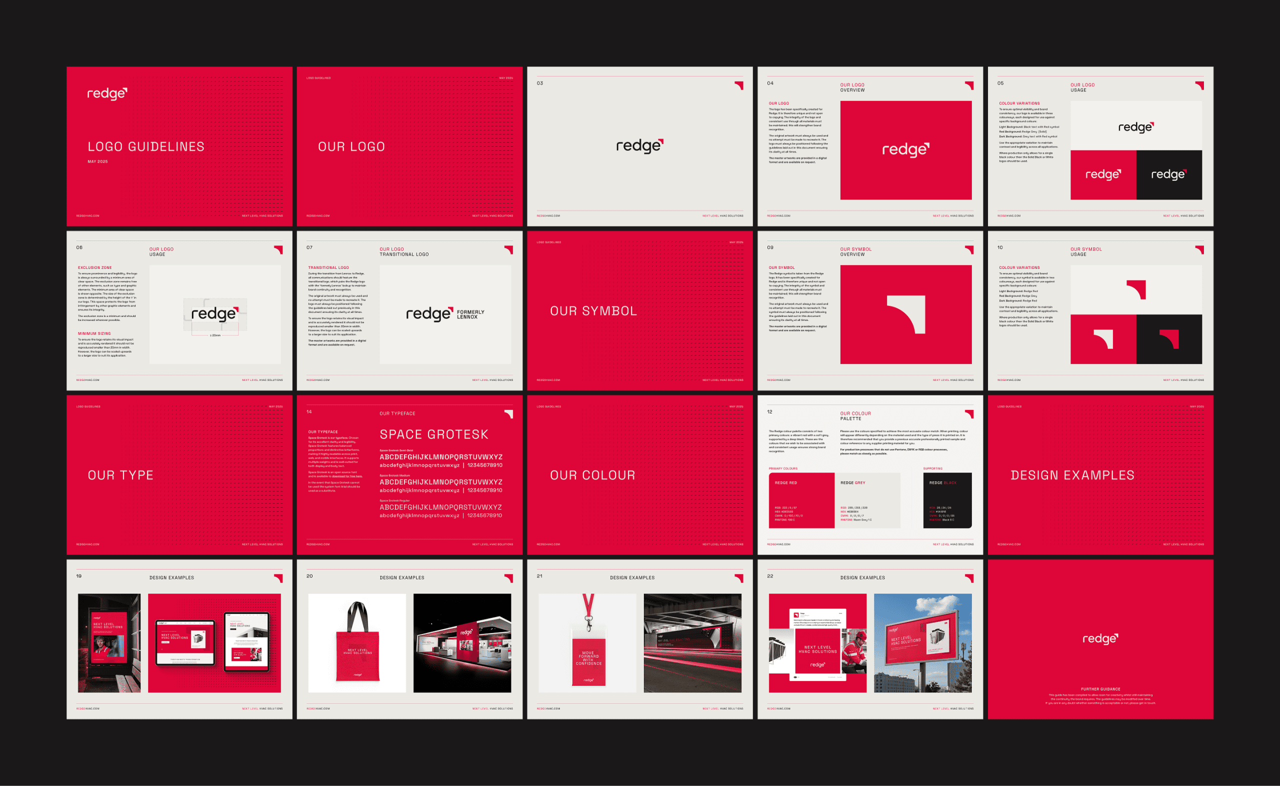
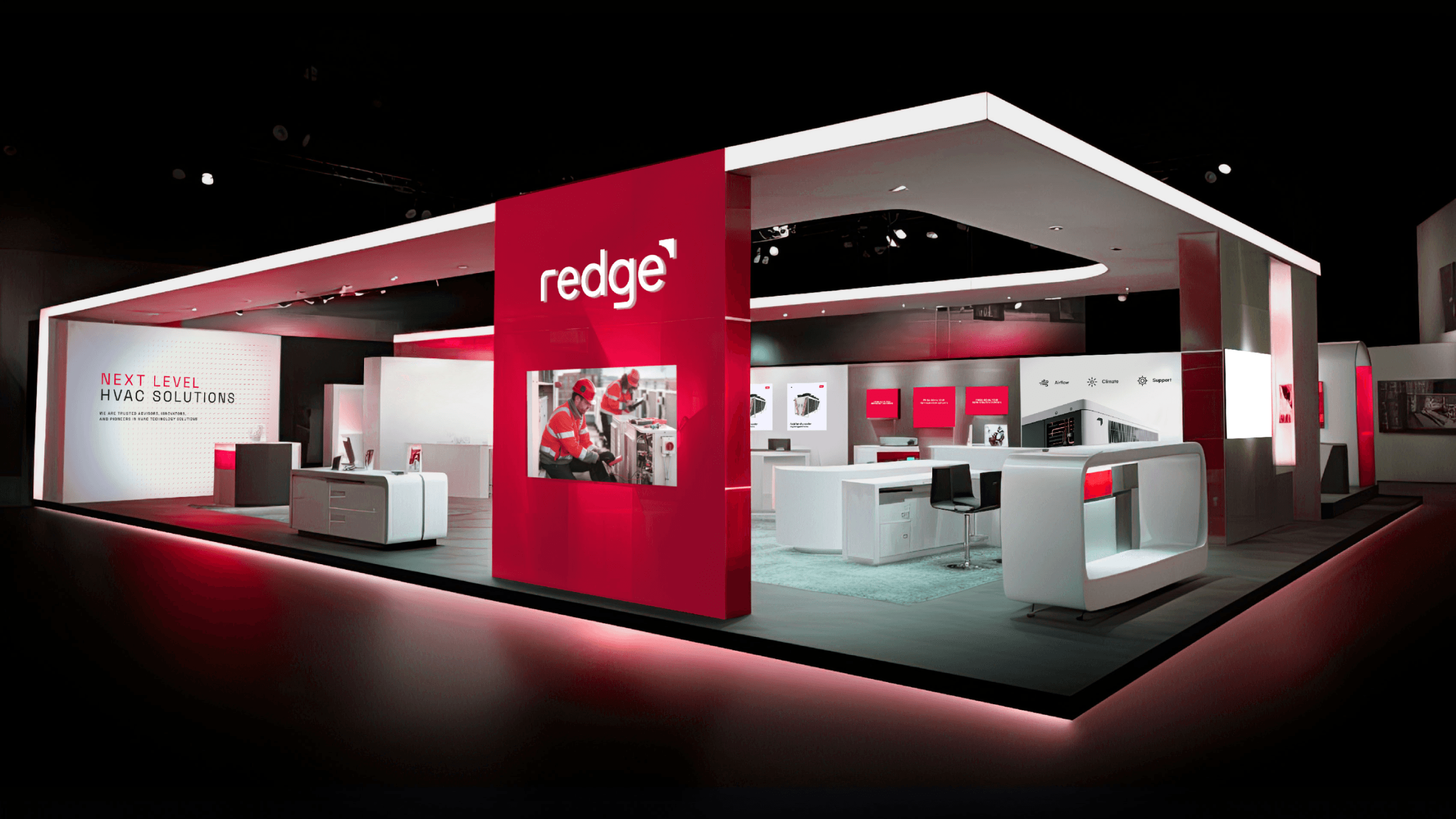
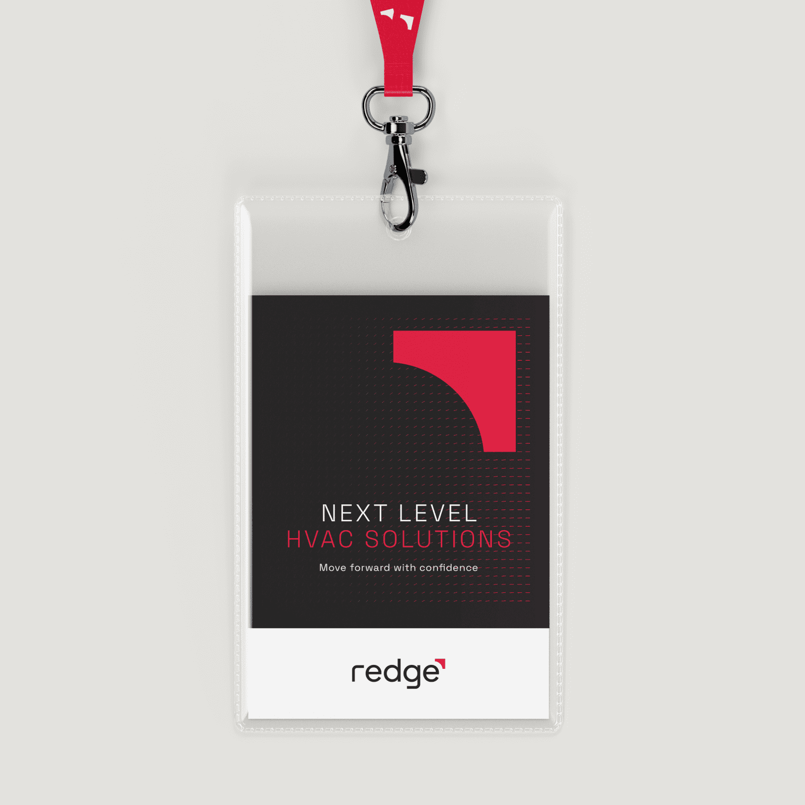
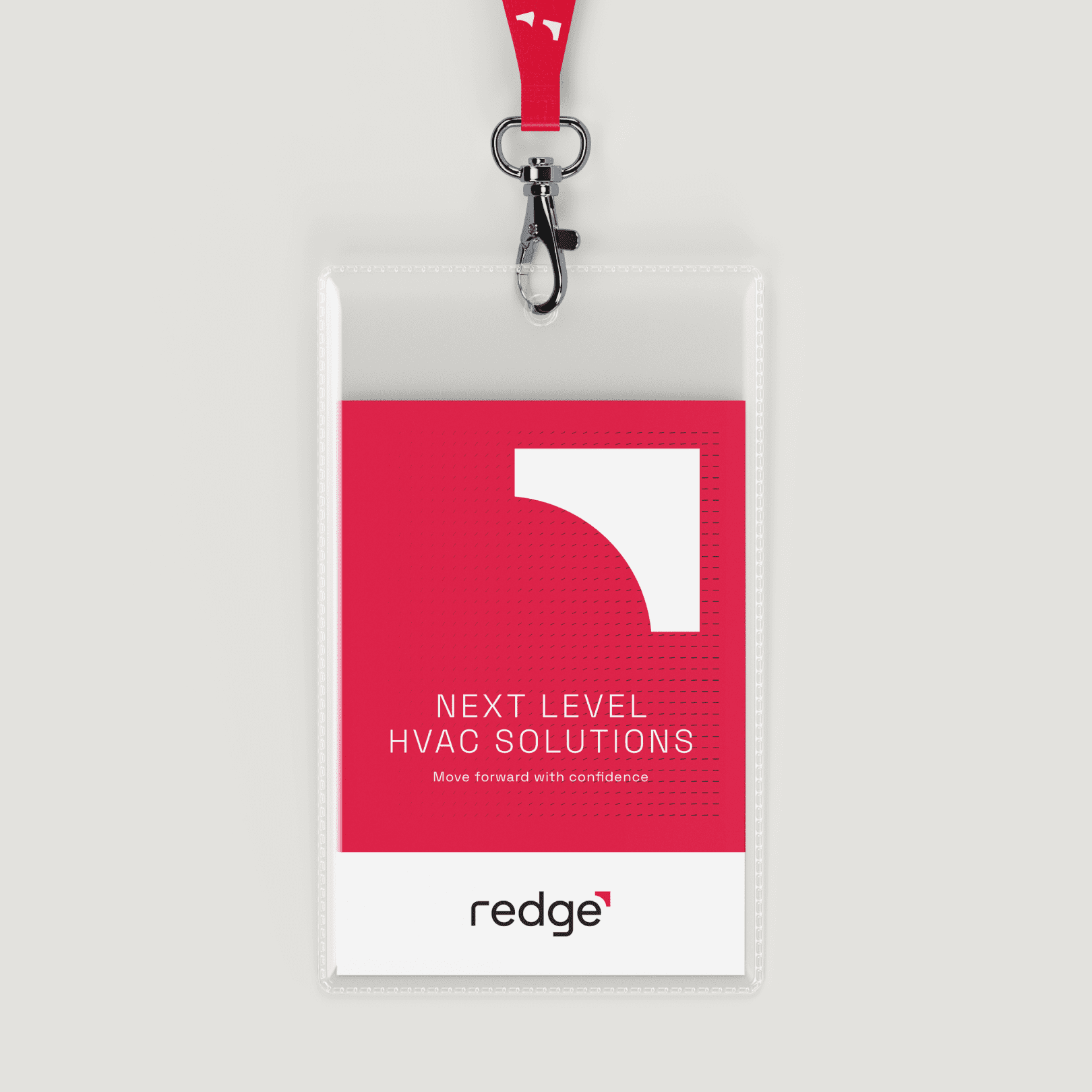
- Equity carried forward: the iconic red edge that had long appeared on products became the cornerstone of the new identity.
- Future-facing positioning: moving from a rooftop specialist to a complete HVAC solutions partner, underpinned by sustainability, efficiency and innovation.
This structured approach gave employees clarity, reassured customers and provided investors with confidence in long-term value creation.
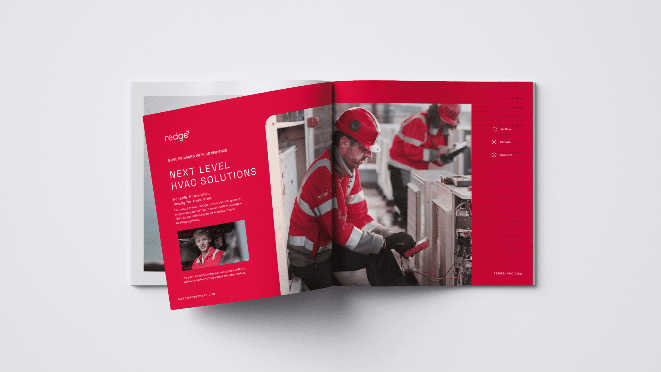
A new name, with a new sense of purpose
The creation of Redge brought legacy and ambition together in a single identity.
- Derived from the ‘red edge’ that had always symbolised product quality and from ‘leading-edge’ solutions driving progress.
- Short, memorable and tested for clarity across languages – critical in B2B adoption across EMEA.
- Backed by legal protection and a clear domain strategy to support digital visibility and growth.
To ensure continuity in communications, we devised a brand architecture roadmap defining where and when “formerly Lennox” was included in the new identity. The new name has secured differentiation by owning the colour they are positively associated with. It supports the new positioning as a complete HVAC solutions partner spanning multiple product groups. Redge is short, easy to remember and designed to reflect a brand committed to innovation, sustainability and customer success.
Launching Redge, a united movement
The launch of Redge in 2025 was a collective reset. Employees across EMEA marked the moment together, proud of their heritage and energised by a clear direction for the future.
The campaign centred on three simple messages:
- Legacy and trust – “Same people. Same passion. The original pioneers.”
- Symbol of change – the red edge on every system is now the brand itself.
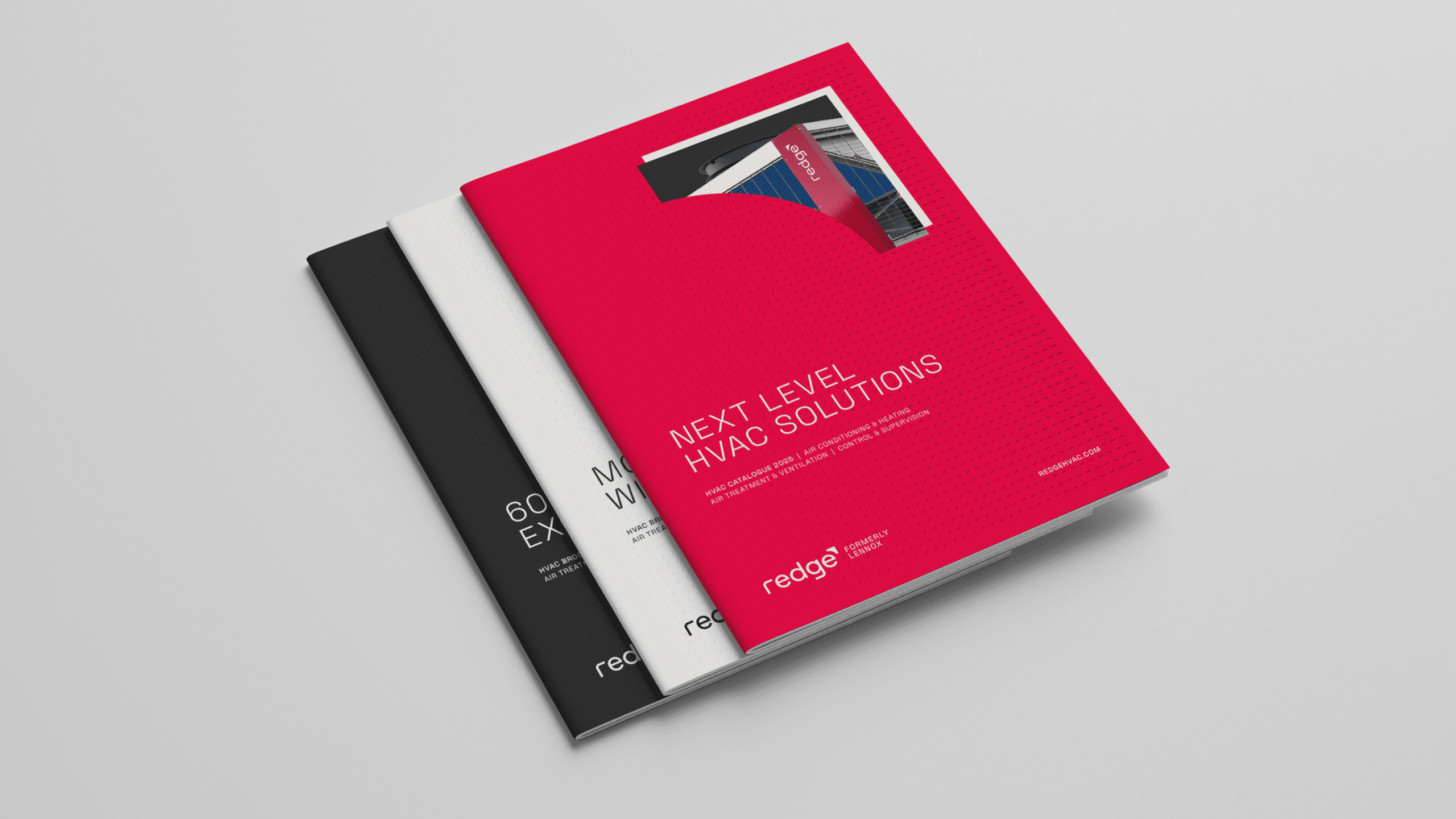
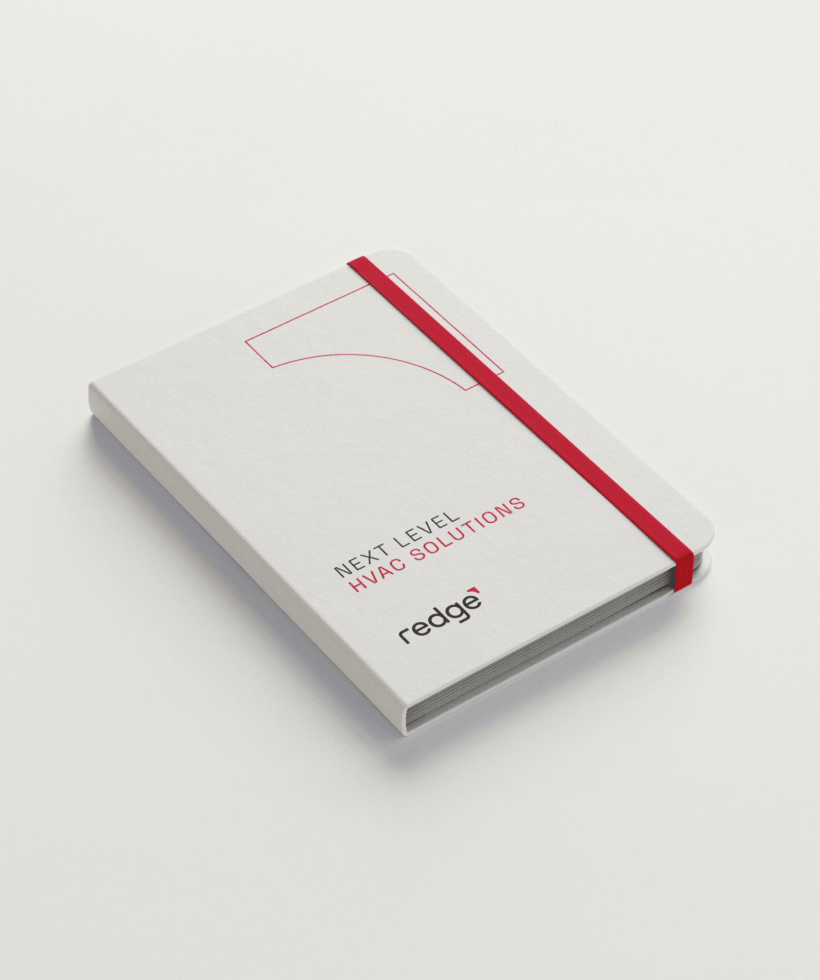
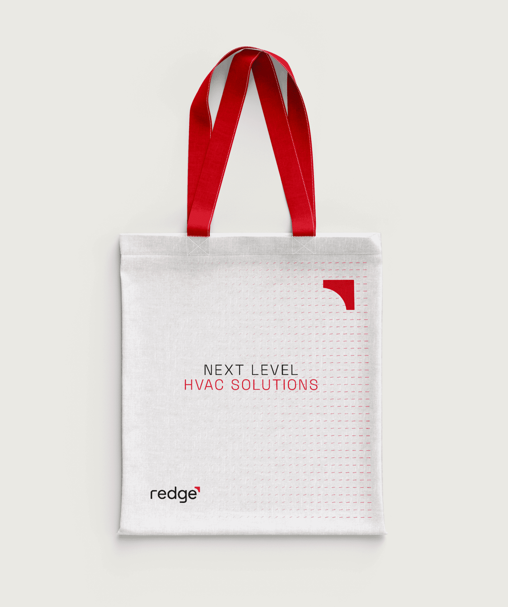
- Future direction – “Next Level HVAC Solutions” expresses ambition in technology, service and sustainability.
Redge has turned a legal necessity into a strategic advantage, taking the equity of an iconic brand and sharpening it into a new era of growth.
Learn more about the project
- A legally protected new name and brand identity secured across EMEA, reflecting legacy while signalling future ambition.
- Positioning rooted in customer and market insight, creating clear differentiation.
- A contemporary identity with standout design and recognition in a crowded market.
- Preserved brand equity and unlocked opportunities for expansion into new verticals.
- Strong employee and customer engagement through a structured transition strategy.
- Equipped sales and distributor teams with a simplified brand architecture and clearer product story, making it easier to win and retain B2B customers across EMEA.
- Secured investor confidence in a scalable, future-ready platform.
Brand strategy
- Strategy workshops
- Brand audits
- Brand architecture
- Competitor analysis
- Stakeholder interviews
- Research + insights
- Brand strategy
- Brand positioning
- Tone of voice
- Naming
- Employee brand strategy
Brand identity
- Brand development
- Brand guidelines
- Logo design
- Print design
- Packaging design
- Digital asset design
- Presentation design
- Motion design
- Event + stand design
- Environmental design (signage, interiors, exhibitions)
- Iconography + illustration systems
Websites
- Campaign landing pages
Campaigns
- Copywriting
- Content creation
- Brochures
- Presentations
- Adverts
- LinkedIn campaigns
- Marketing communications
- Sales enablement materials
Brand insights and ideas
Strategic brand positioning: why are B2B brands repositioning now?
Drag me